
In his inaugural class at Brown taught this past spring, Professor Reuben Fischer-Baum rethinks the expression “A picture is worth a thousand words.” In his world, pictures explain a thousand (or more) data points, and those pictures need the right words to be effective. His class, DATA 1500: Data Visualization and Narrative, is unlike any other offered at Brown, and the students absolutely loved it.
“This was honestly one of my favorite classes I’ve taken at Brown,” says Elizabeth Duchan, one student who graduated this past spring and concentrated in Behavioral Decision Sciences. “I had been super interested in the concept of data storytelling and being able to take very complex and often indigestible information and translate it into a language that everyone can understand. So Reuben’s class was really a perfect course for me.”
Professor Reuben Fischer-Baum is an Adjunct Lecturer at Brown and RISD and a working graphics editor at the Washington Post. When he moved to Providence, he pitched the idea to DSI for a class focused on creating polished data visualizations and finding narratives in data.
“One of the things I really like about my job as a graphics editor at the Washington Post is the split between this creative, somewhat subjective design work, and the very analytical quantitative work,” Fisher-Baum says. “I wanted to design a class with this premise.”
The course begins as a technical primer for building data visualizations using code, mainly in R, and focuses on the graphic design decisions that elevate visualizations like color, hierarchy, and font selection. The course then transitions into a RISD-style workshop class where students learn how to critique each other’s work and iterate on the design process. The class culminates with individual narrative data projects that the students have published online. Each student’s final project includes at least three polished visualizations and a cohesive narrative connecting the graphics.
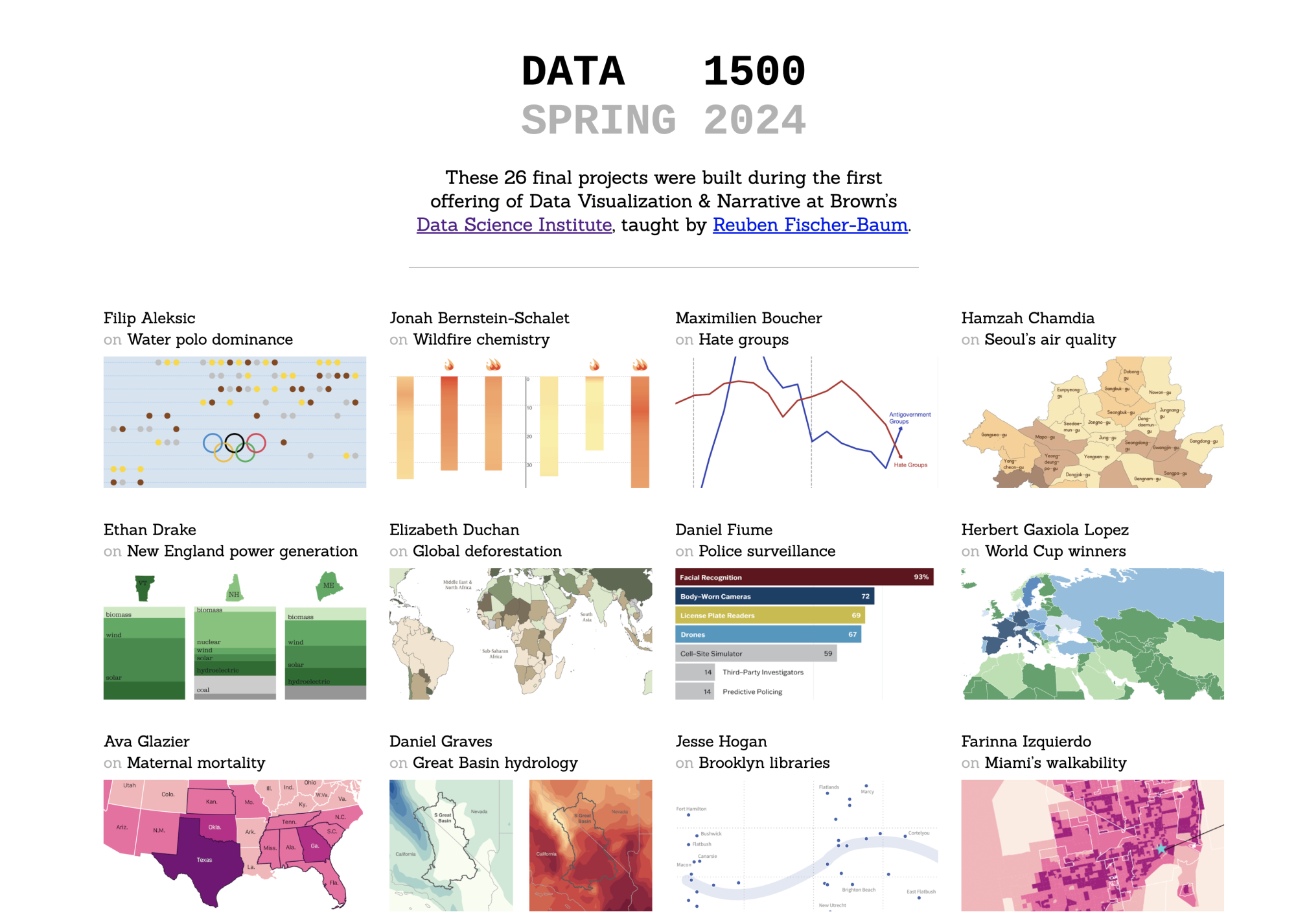
Unique among classes at Brown, this course starts with pure data analysis and problem sets, and then quickly transitions into the more subjective design territory. “Something I was a bit nervous about going into teaching this course was the critiquing aspect, where we would put each other’s graphics projects up on the wall and start talking about them. This style of class is different from most technical classes at Brown,” says Fischer-Baum. “But people seemed to really embrace that part. I was pleasantly surprised.”
According to Elizabeth Duchan, the students did indeed embrace these round-table critiques. “It was really cool to have these open discussions about things we really liked about visualizations and the things we would change,” she says. “We were able to pick apart so many little things about the design that we would change, even from some pretty esteemed sources, like the New York Times. It just goes to show how small details make such a huge impact when you’re thinking about data visualization.”
Professor Fischer-Baum placed an emphasis on telling personal stories through data and encouraged students to use data they might already be working with for other projects, classes, or theses. “Everyone got to choose their own data set for their final project, which means they had to have some reason that they cared about it,” says Fischer-Baum.
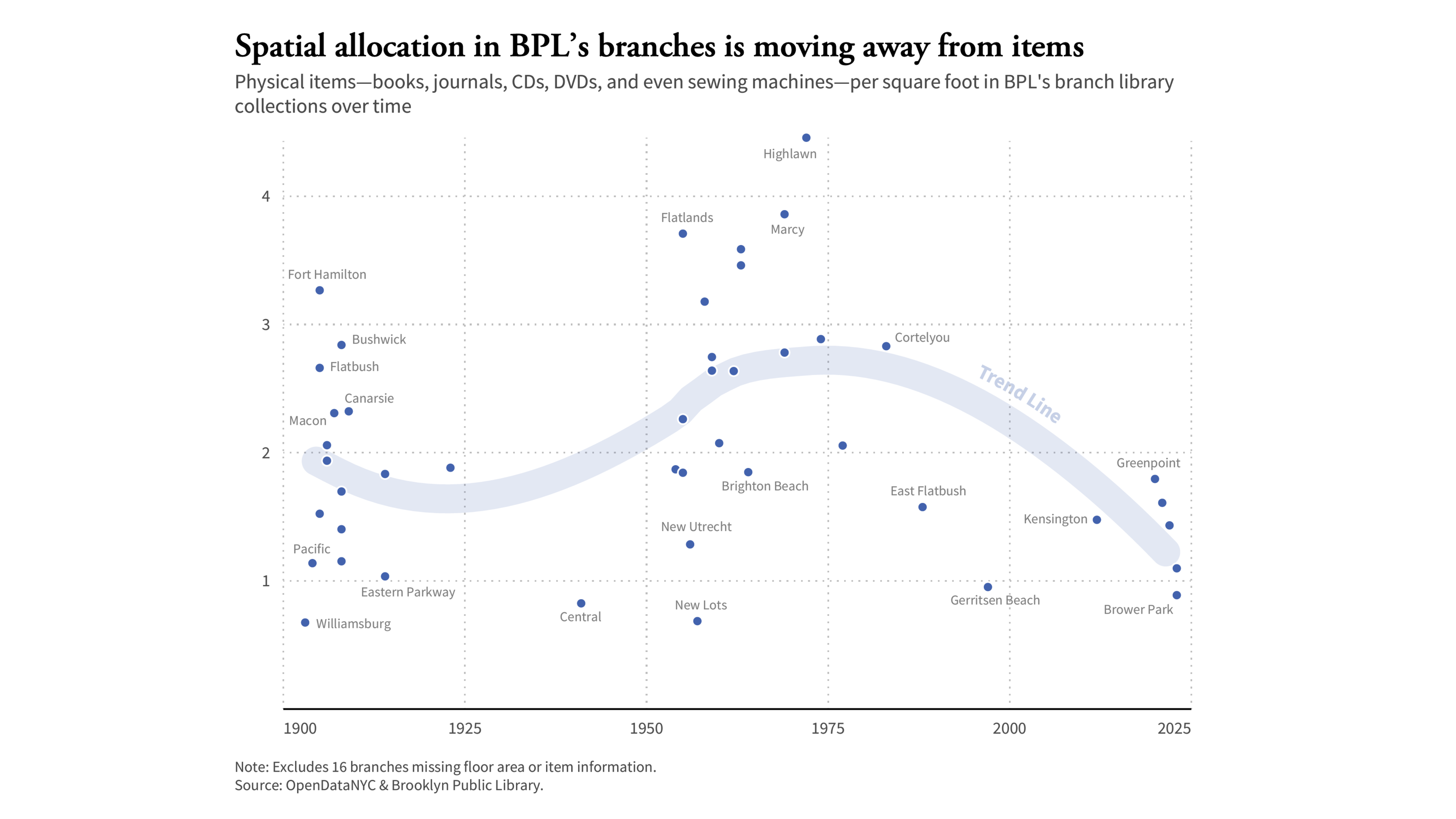
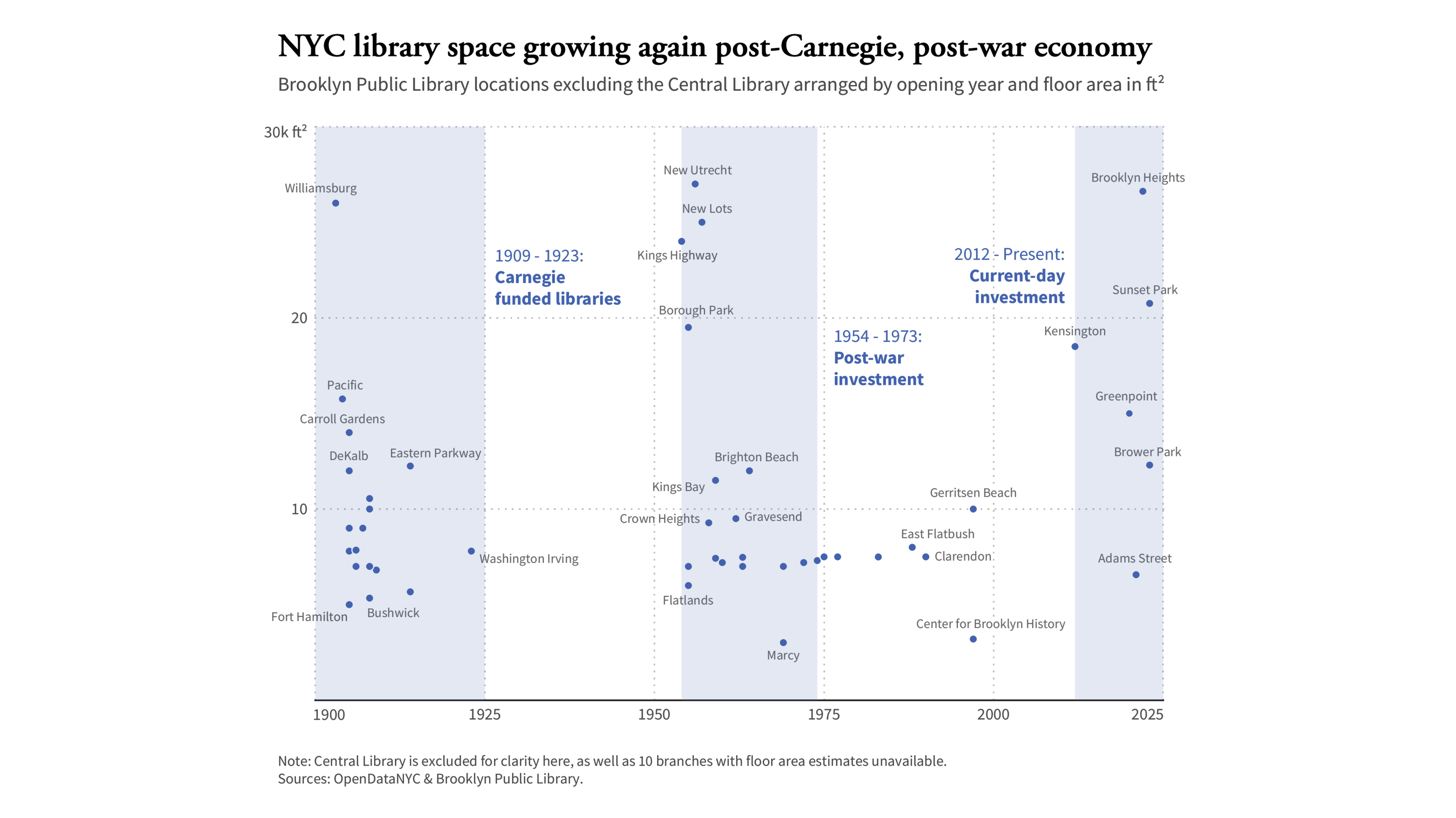
Recent graduate Jesse Hogan was doing research on the Brooklyn Library system for his senior capstone project. He decided to use the same data for his final data visualization project, The Brooklyn Branch Library System: Tracing New York City's Past & Present Investment in People and Information.
In his project, Hogan discovered a trend in the data that confirmed some of the claims his capstone sources had told him.
“As I was doing interviews for my capstone project, one of my sources told me that libraries in the city are moving a lot more towards creating spaces for people, as opposed to collections,” says Hogan. “I really clung to that idea throughout the semester, and I thought space to timing mapping visualizations would be interesting. In my last visualization, you can see how collection space is trending down. I was able to confirm with data what she told me verbally, which was really cool.
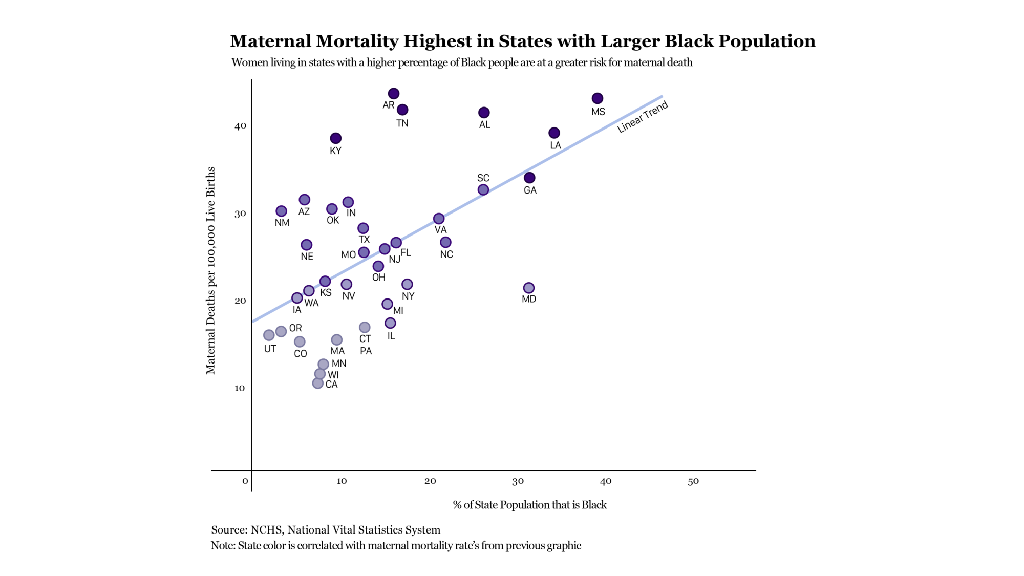
Recent senior and current Master’s student in Public Health, Ava Glazier, decided to focus on maternal mortality in the US for her project. “With healthcare, there are unfortunately so many disparities in the US and so many different things to look into, so I knew I would be able to find an interesting story,” Glazier says. “I started with a CDC data set on maternal mortality in the US, and then I broadened it as different questions came up, looking at different policy aspects.”
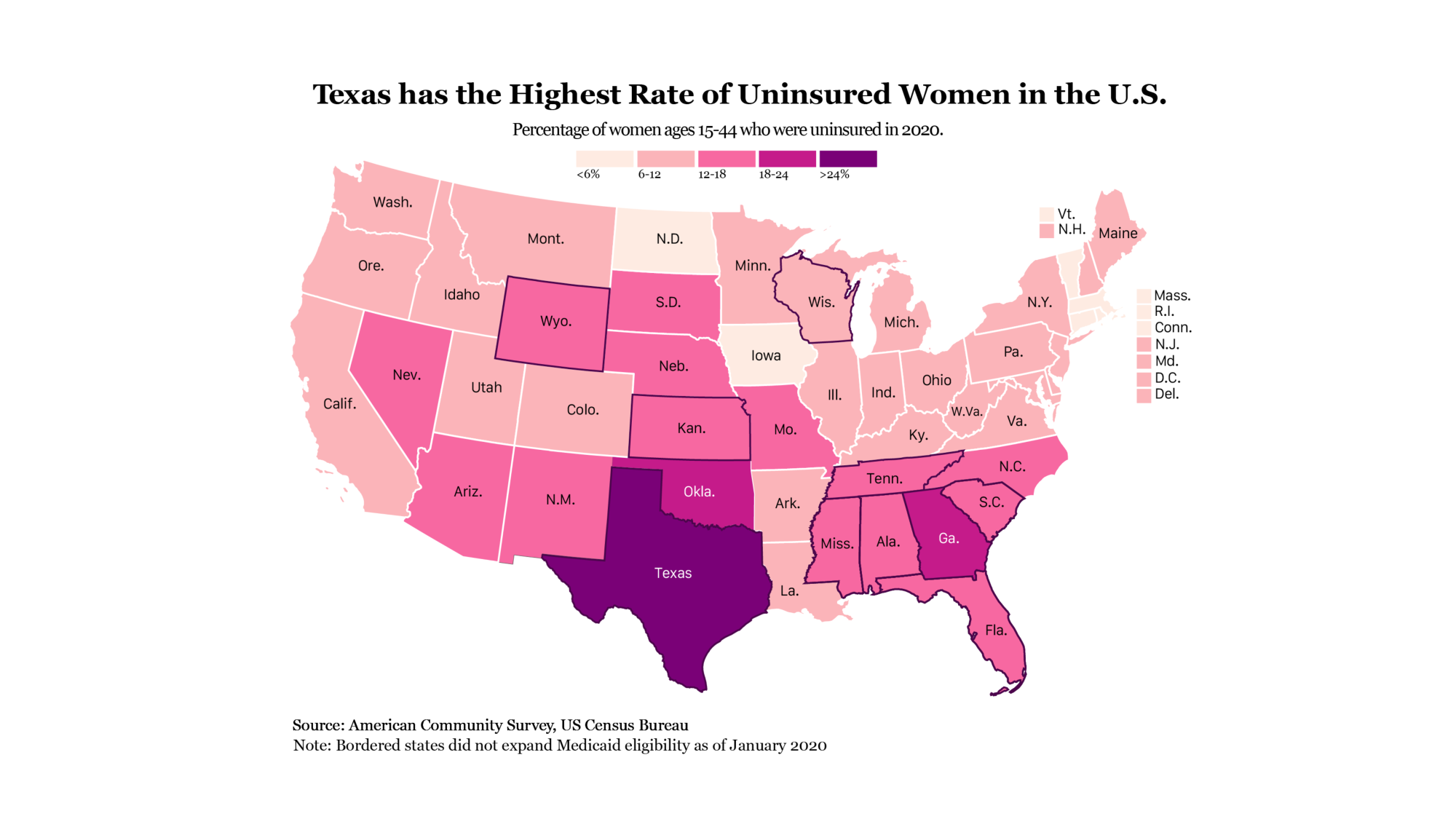
“Human beings respond really well to narrative structures. It makes things interesting to read and digest,” says Fischer-Baum, explaining why it’s important to situate graphics within an overarching narrative, as his students do in their final projects. “It’s not helpful to just make a bunch of charts. You have to figure out how to connect them and present them, and narrative is essential in making that work.”
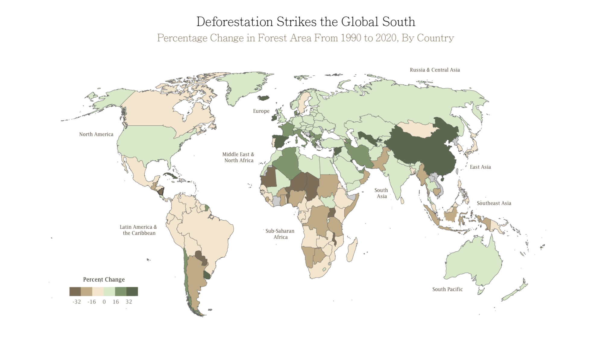
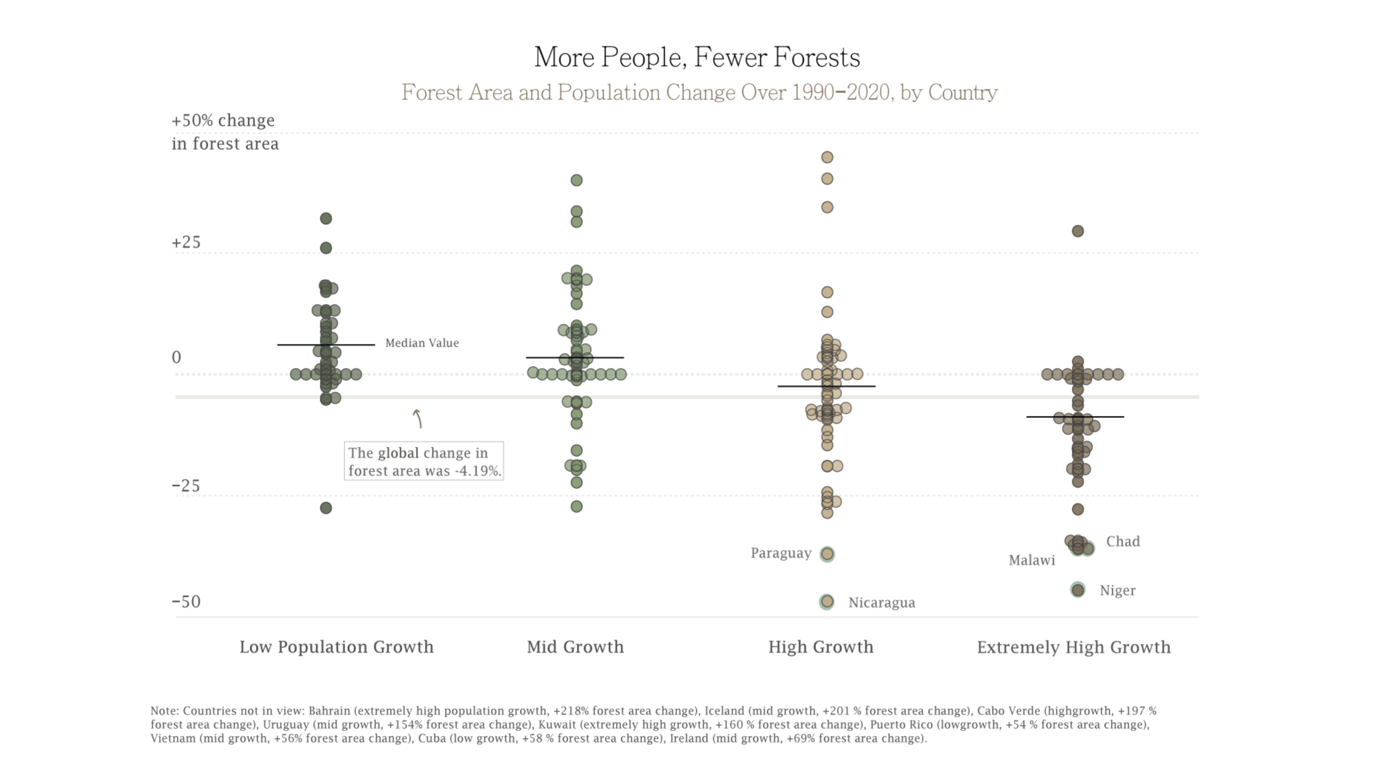
Elizabeth Duchan thought a lot about narrative structure as she explored trends in global deforestation for her final project, The Rise of Deforestation Is Rooted in Place and Population. “I wanted to take a very top down approach in my narrative. Obviously, there’s been a rise in deforestation, but I wanted to go narrower. I started looking at different countries, narrowing my scope and looking at the effect of population growth,” she says.
“I was looking for a consistent trend in the data, and I found a counterintuitive one. Though the overarching trend is that there’s been an increase in land forest area loss, when you look a little more granularly, some countries have really spiked in deforestation while others have actually gained forest area. Learning to uncover narratives that don’t really match your expectations is powerful.”
Fischer-Baum emphasizes why teaching this course is vital in the current moment. “If you’re trying to communicate to your peers or a broad audience about important topics like public health or climate change, it’s essential to have polished graphics and easily understandable narratives around data. In a world where it’s really easy for AI to produce a bunch of generically fine graphics, having the skills and the design knowledge to elevate something into a really good and clear graphic is especially important.”
Fischer-Baum’s students appreciated his perspectives and background in data journalism. “One of the things that was so great about this class was Reuben’s real-world and current experience in journalism,” says Ava Glazier. “It’s a fresh perspective you don’t normally get in academia.”
Glazier’s enthusiasm for the course and its professor is not isolated. “Reuben is an incredible instructor and this was one of my favorite courses I’ve taken at Brown. He made a strong effort to meet each of us where we were and made the time to give each of us personalized instruction,” reads one anonymous course review. “This is a class you cannot afford to miss!!” shares another.
“The skills I’ve learned in this class, especially in science communication, will be really useful for my PhD,” says Poom Yoosiri, a recent graduate who studied geophysics. “Having a better understanding of how people generally perceive data and how that can be used to effectively communicate my findings to the widest audience will be very helpful.”
As an instructor, Fischer-Baum hopes that his class will make his students better appreciators and critics of design that exists in the world. “Visualization is a really big part of how we make arguments around data and claims about research,” he says. “So understanding the design decisions that go into graphics, and getting an eye for seeing that in the world – I think that would be a great takeaway from the class.”
Fischer-Baum plans on teaching the course again in Spring 2025 and has designs to expand the curriculum with a follow-up course on animated and interactive visualizations in the future. He also hopes that someday he can teach a crossover class between Brown and RISD, bringing together the data analysis and graphic design strengths of each institute.
“Data science is the practice of asking good data questions and answering them,” says Fischer Baum. “Being able to take a data set, figure out what you want to know from it, and then determine the appropriate ways to learn those things – I feel like that’s the through line of data science as a discipline, whether or not you’re doing it in this visualization context.”
Explore the rest of DATA 1500’s final projects here: https://data1500.github.io/spring-2024/
Explore Reuben Fischer-Baum’s work as a graphics editor here: https://www.reubenfb.com/